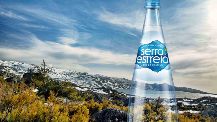
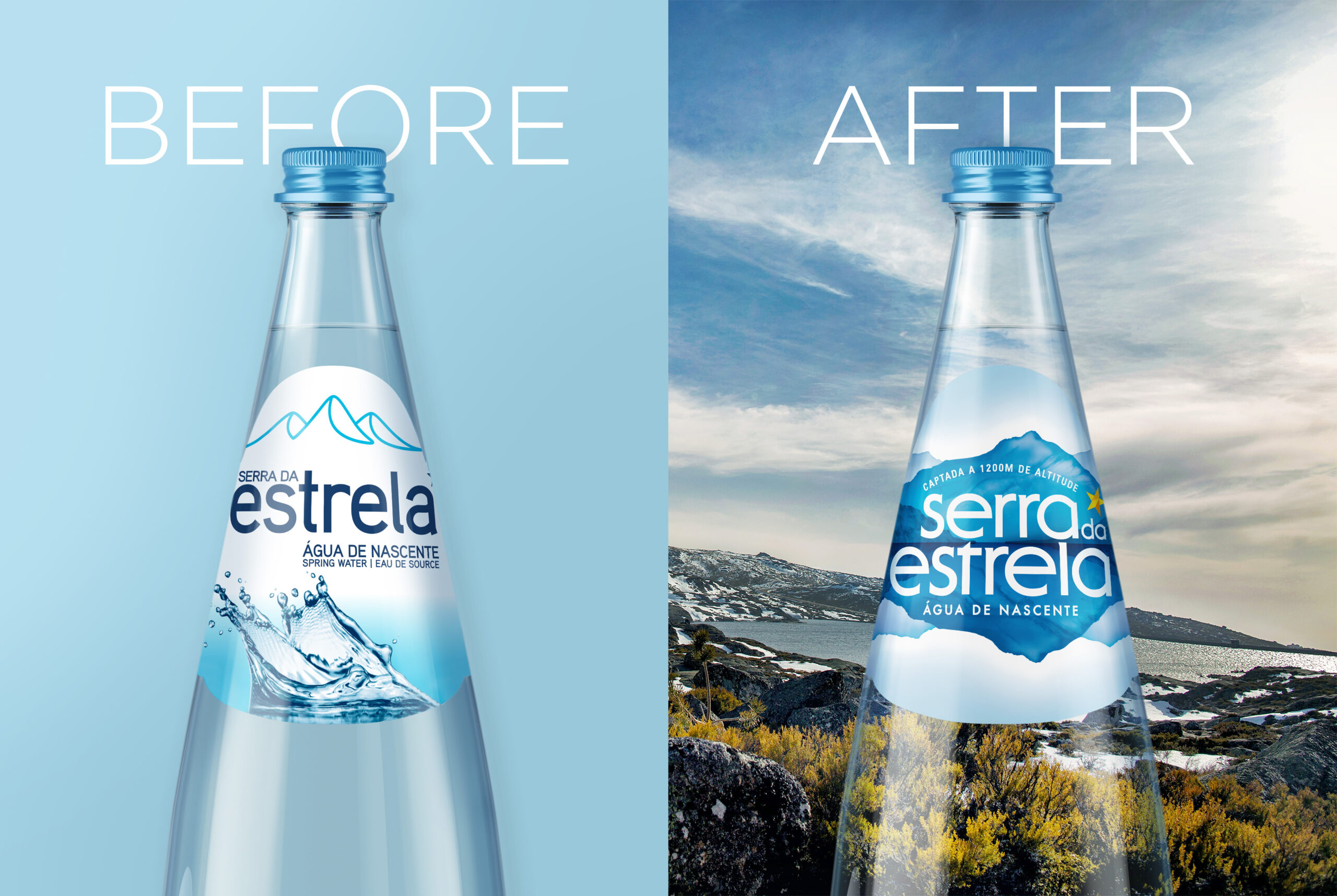
Água Serra da Estrela, Portugal’s iconic mountain spring water from the Serra da Estrela region, has unveiled a bold new visual identity in 2025—signaling both brand evolution and stronger commitment to environmental stewardship.
Rooted in Place, Reimagined for Impact
Design studio BrandMe spearheaded the creative upgrade, honoring the purity and heritage of the Serra da Estrela region:
-
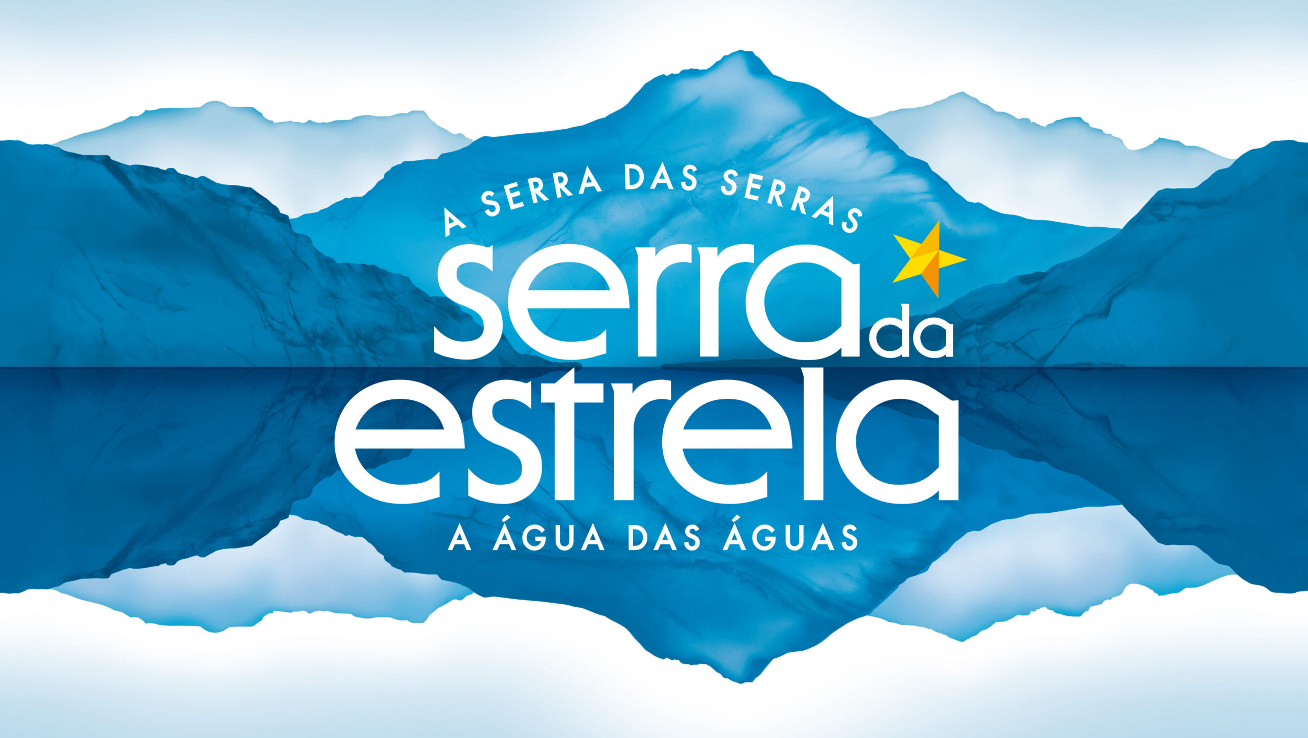
Redrawn logo and landscape illustration: A stylized silhouette of Serra da Estrela with its mirrored reflection celebrates the water’s crystalline origins and regional pride.
-
Retains iconic star motif: Building on historical brand equity while adding a modern, ownable personality.
-
Unified across formats: Consistency between PET and glass packaging amplifies brand recognition.
“We wanted the design to resonate with the soul of the region and the landscape that help to create the crystal clear water of Serra da Estrela.”
–Clare O’Brien, BrandMe Design Director
Sustainability Woven In
This rebrand goes beyond aesthetics—environmental responsibility lies at its core:
-
-
Reforestation efforts: Since 2002, over 1.5 million trees have been planted in partnership with ICNF and IKEA, reinforcing its commitment to biodiversity.
-
First 6 L RPET garrafão in Portugal: This jug is made from 100% recycled plastic, reducing up to 70% of carbon footprint per unit and saving over 150 tonnes of virgin plastic annually.
-
Circular packaging philosophy: All PET bottles have contained 25% recycled content since 2017, reducing plastic use by 39%.
-
Returnable glass packaging: Promoting reuse and adherence to environmental directives.
-
Strategic Marketing Manager Joana Ferreira highlights that sustainability is a core brand pillar, supporting differentiation and circular economy goals.
Strategic Takeaways for Brands
-
Authentic storytelling: Merging region, heritage, and visual identity creates an emotional connection.
-
Eco-centric innovation: Pioneering recycled plastic usage in bulk packaging demonstrates true sustainability commitment.
-
Visual and structural coherence: Introducing consistent design across formats reinforces brand unity and consumer recall.
Credit
- Agency/Creative: BrandMe
- Article Title: Serra da Estrela Redesign
- Organisation/Entity: Agency, Published Commercial Design
- Project Type: Packaging
- Agency/Creative Country: United Kingdom
- Market Region: Europe
- Project Deliverables: Brand Identity, Brand Redesign, Graphic Design, Packaging Design, Tone of Voice
- Format: Bottle
- Substrate: Glass Bottle, Plastic
Água Serra da Estrela’s 2025 brand refresh is a masterclass in purposeful design and mindful branding. By integrating a refreshed visual identity with deep-rooted sustainability actions—from landscape-inspired aesthetics to recycled packaging and reforestation—the brand stands not just for purity, but for environmental responsibility and forward-thinking brand evolution.
Want to explore how your brand can combine design storytelling with genuine sustainability? Reach out to the Grey n Black team—we’d love to help.