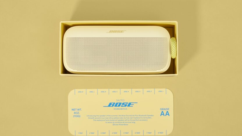
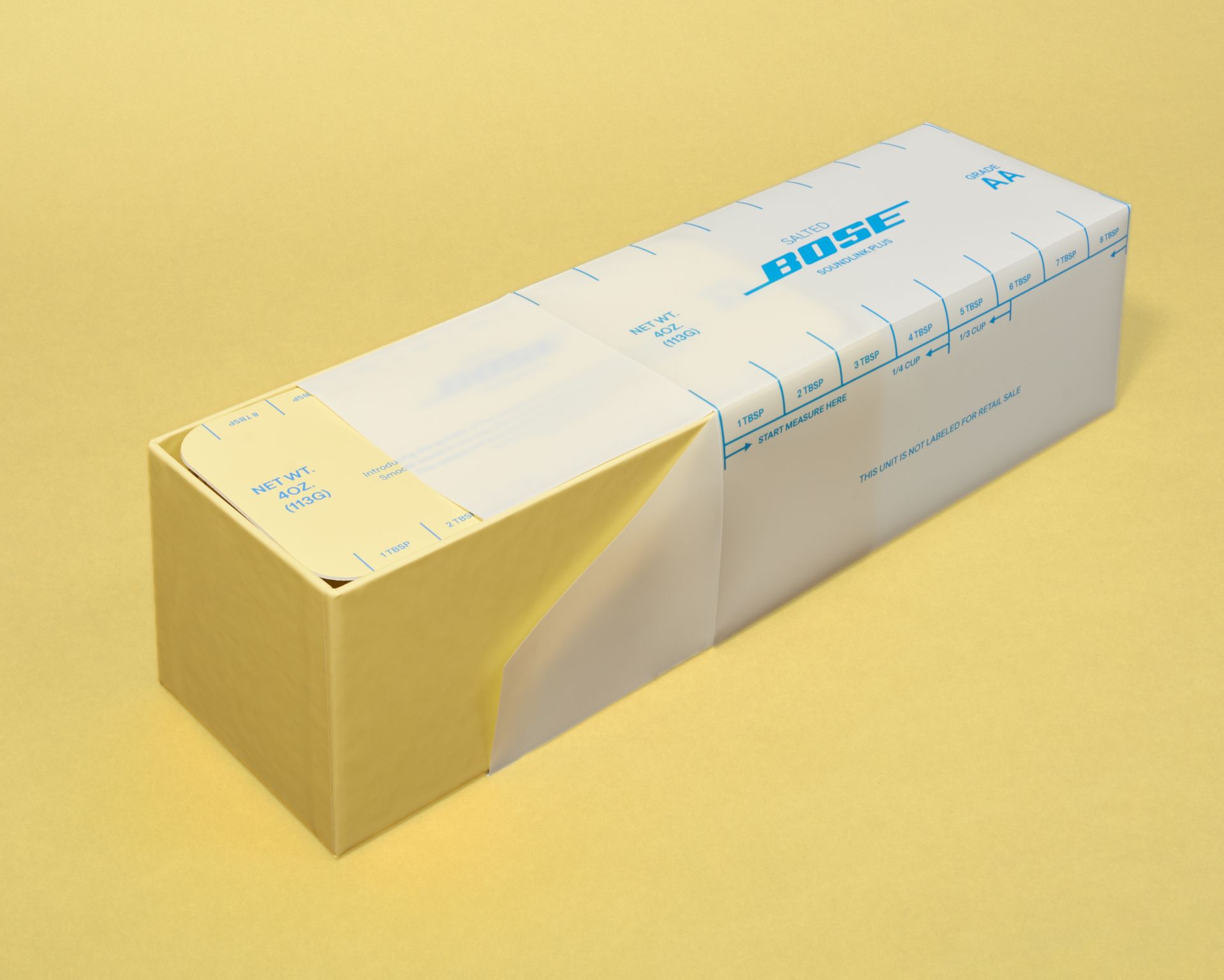
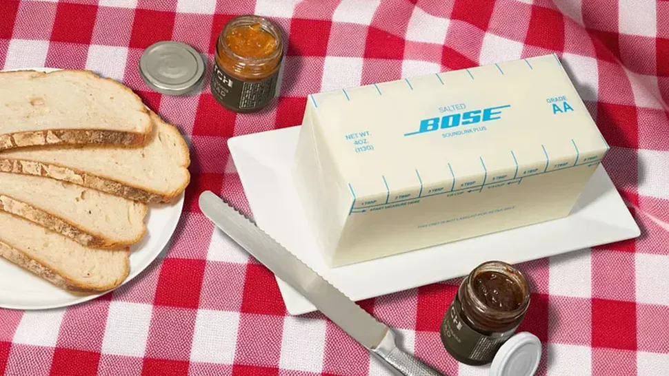
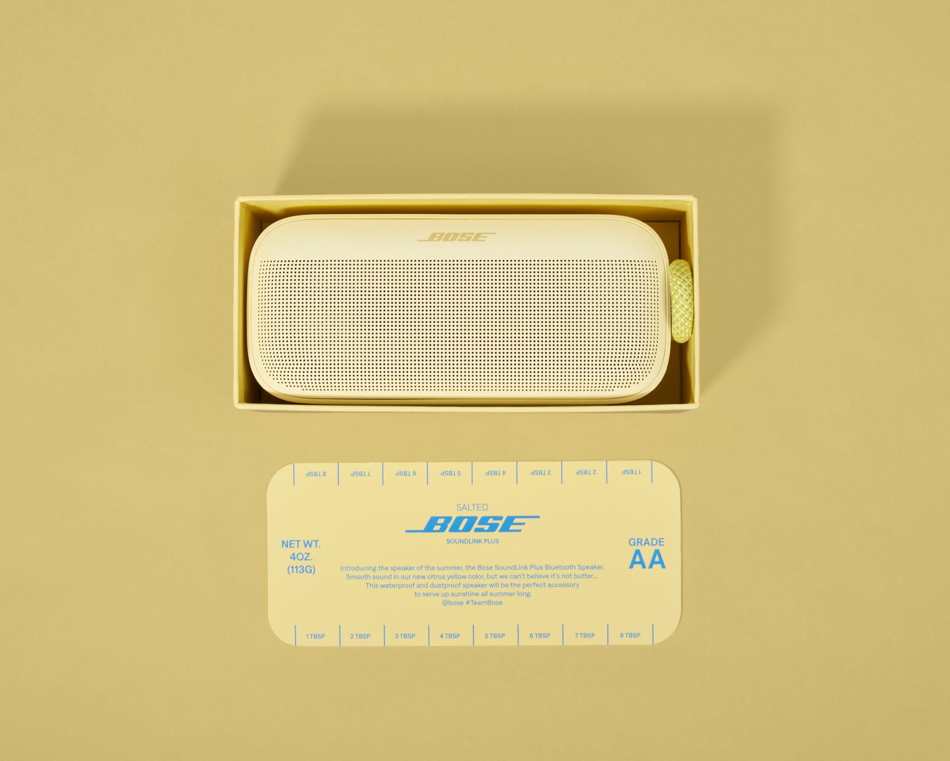
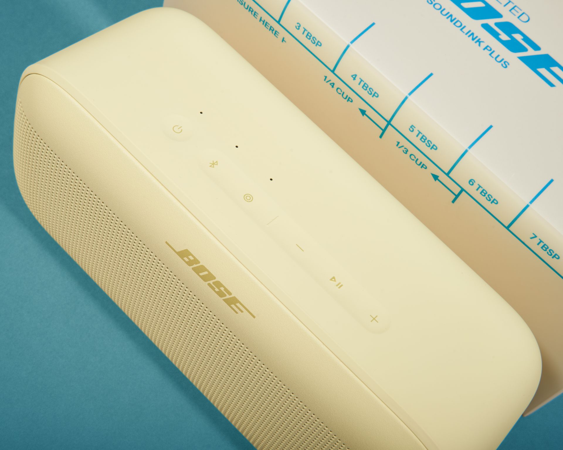
In an era where packaging is about more than protection—it’s storytelling—Bose has churned out a design delight. The audio brand’s special Citrus Yellow SoundLink Plus speaker isn’t just trendy—it arrives in packaging designed to look like a stick of butter, tapping into the viral “butter yellow” color craze of 2025.
Butter Yellow: The Color That’s Spreading Everywhere
The pastel hue, dubbed “butter yellow,” soared in popularity after being spotted in Louis Vuitton’s Spring 2024 runway presentations. Forecasting giant WGSN suggests the shade’s rise reflects consumers’ craving for nostalgia, optimism, and comfort amid uncertain times.
Packaging That Melts into Culture
Bose leaned into this trend with an imaginative twist: packaging the Citrus Yellow speaker like a classic butter block—from its hue to paper wrap and measurement lines. Designed by CNC Agency, it’s a nostalgic, eye-catching piece of packaging with equal parts humor and visual flair.
Crafted for a limited-edition seeding kit, the packaging wasn’t made for retail—but you can still buy the regular Citrus Yellow speaker on Bose’s website.
Why This Packaging Works So Well
-
Trend alignment: Signals being culturally tuned-in with a color dominating fashion, interiors, and branding.
-
Memorable design: Makes the product stand out physically and emotionally—a package people notice, share, and talk about.
-
Brand personality: Shows Bose isn’t afraid to be playful—grounding high-tech audio in light-hearted design.
CNC Agency’s Creative DNA
CNC Agency, the creative force behind this butter-inspired packaging, is more than a branding studio. Known for weaving AI, immersive tech, and experiential storytelling into campaigns—its Innovation Lab explores physical-first experiences, from VR to projection-mapping, redefining how brands show up in the real world.
Final Thought
With the butter-ticket packaging, Bose serves up design that’s both comforting and bold—a reminder that smart packaging can be a brand’s frosting, not just its wrapper. As we move deeper into 2025, colors like butter yellow show how small, well-executed creative decisions can make a brand feel built for the moment—and perfectly preserved in memory.