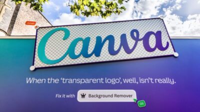

Canva, the design platform known for empowering creators, is diving into the complexities of branding with a new campaign targeting transparent logos—those designs meant to carry no background but often vanish or lose impact in real-world use. The campaign highlights how logos that look good in theory sometimes fail in practice, and positions Canva as the solution for brands that want visibility, flexibility, and consistency.
The Problem: Logos Without Substance
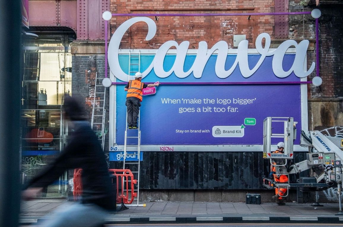
The campaign calls out a common trap in branding: logos that work only in controlled graphics but break down when placed on varied backgrounds—web sites, printed materials, signage, packaging. When a logo lacks solid contrast or structure, it blends into its environment, losing identity and impact.
The messaging centers on the idea that “transparent isn’t always better.” Some logos need boundaries, backgrounds, or design decisions to stay legible and recognisable across contexts.
Canva’s Solution: Tools + Best Practices
To tackle this issue, Canva’s campaign emphasizes:
-
Responsive logo versions: designs that adapt (light/dark, simplified, with background blocks) depending on usage.
-
Design templates and guidelines: helping users create versions of their logos that maintain visibility on any surface.
-
Education and awareness: showing audiences why what seems like “elegant transparency” may compromise brand identity in the wild.
In doing so, Canva positions itself not just as a tool for creating logos, but as a brand integrity steward—protecting how logos appear, where they appear, and how they perform across media.
Why This Campaign Stands Out
| Element | Why It Resonates |
|---|---|
| Uncommon focus | Identity and logo clarity issues are usually behind the scenes, not front-and-center in campaigns. |
| Relevance for all brands | Every brand, from startups to global firms, faces logo legibility challenges. This message scales. |
| Credibility boost | By tackling a technical but essential design problem, Canva asserts domain expertise—not just tool provision. |
| Emotional undercurrent | Logo failure isn’t just aesthetic; it’s a loss of identity, clarity, and dignity for the brand’s voice. |
Final Thoughts
Canva’s “Transparent Logos” campaign is a refreshing reminder that good design isn’t just about what looks clean—it’s about what works. In an era of flexible branding, responsive design, and cross-platform presence, logos must do more than exist: they must adapt, persist, and perform. Canva boldly steps into that gap, inviting creators to think beyond transparency toward clarity and resilience.